The Social Blueprint UX Refresh
The Social Blueprint
Non-Profit, Community, UX
May 2025
Refreshing a platform to boost community connection
Comprehensive UX redesign to highlight content and improve engagement.
Overview
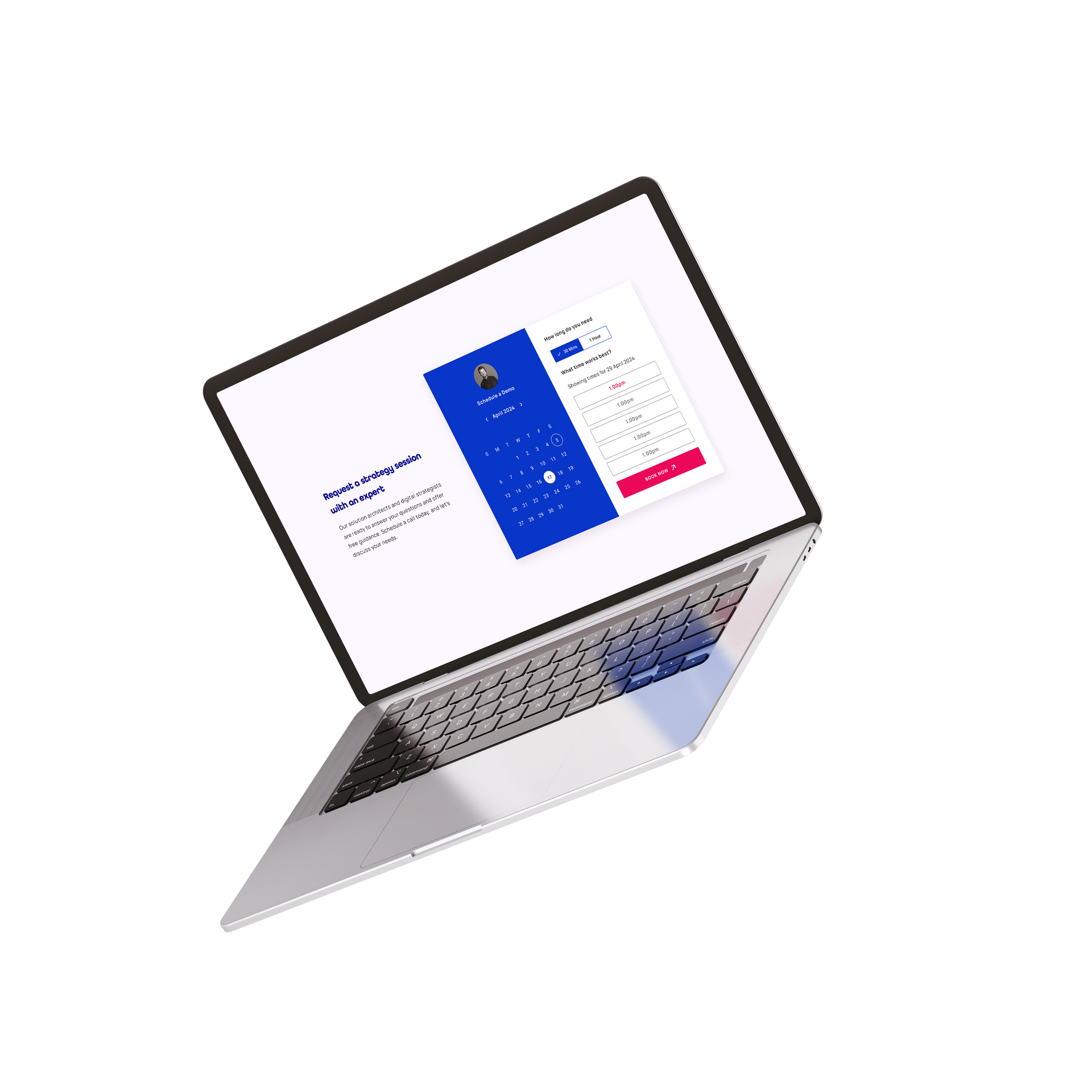
UX redesign of platform highlighting podcasts, events, and community resources.
Challenge
Poor navigation affecting user engagement.
Approach
Improved information architecture, user-driven content tagging, responsive redesign.
Result
Improved content discoverability & Hebrew language support.
"Designing for community isn’t about features; it’s about making people feel at home."
The Social Blueprint is a not-for-profit platform serving Melbourne’s Jewish community. It’s part directory, part events hub, part storytelling platform — but its existing site was failing to engage users. Navigation was unclear, content felt buried, and users struggled to find what they needed.
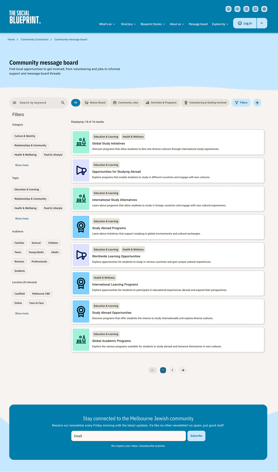
The brief was ambitious: refresh the UX in a way that honoured the platform’s grassroots feel while making it more scalable, accessible, and engaging. The first challenge was information architecture. The site held podcasts, events, aid resources, and lifecycle listings — each with its own structure. Mapping these into a logical hub-and-spoke model gave users clearer entry points while keeping navigation consistent.
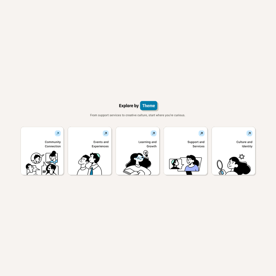
Design workshops with the client revealed a second challenge: balancing inclusivity with simplicity. The community is diverse, spanning all ages, religious levels, and cultural backgrounds. The site needed to feel welcoming without overwhelming. To solve this, I introduced content tagging and filtering that allowed users to browse in ways that suited them — by topic, type, or audience.
The redesign also included responsiveness and accessibility as non-negotiables. Many users access the site via mobile, so layouts were built mobile-first, with legible typography and contrast-safe colour palettes. For a community platform, it was also important to support multiple languages, including Hebrew — a technical and design challenge solved with flexible font systems and RTL layout support.
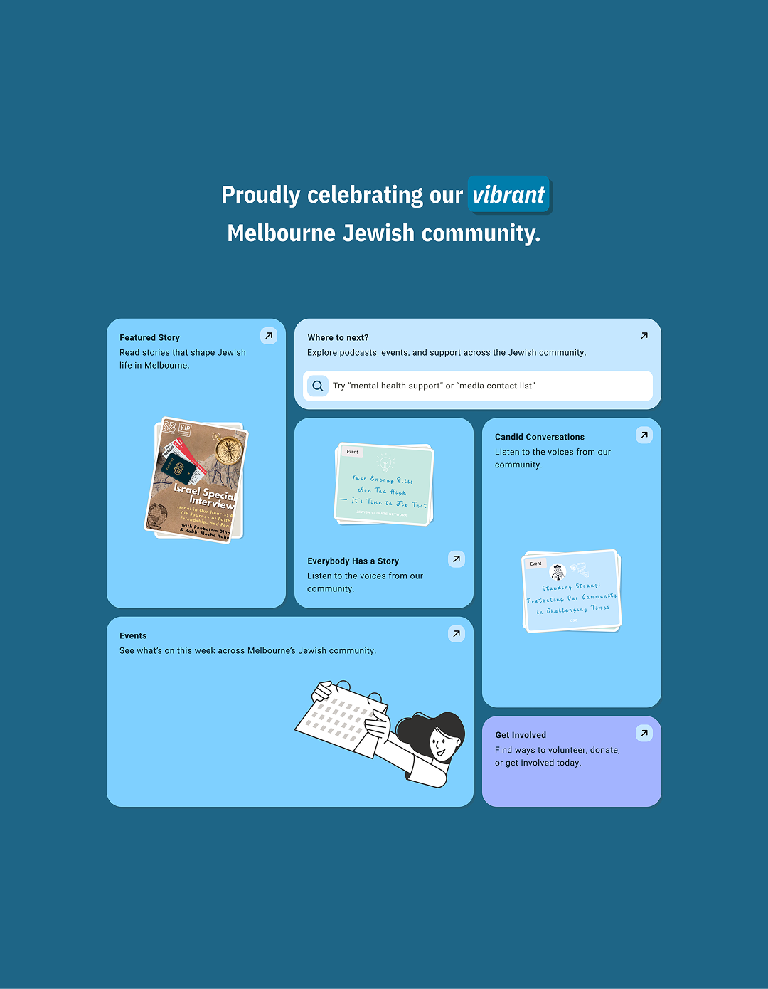
The refreshed site now highlights community stories, showcases events more effectively, and gives users simple, predictable ways to navigate. Early testing showed higher engagement with podcasts and events, and stakeholders praised the clarity of the new structure.
Most importantly, the design made the Social Blueprint feel like a true digital home for the community. It’s no longer just a resource — it’s a platform that celebrates and connects people.
The brief was ambitious: refresh the UX in a way that honoured the platform’s grassroots feel while making it more scalable, accessible, and engaging. The first challenge was information architecture. The site held podcasts, events, aid resources, and lifecycle listings — each with its own structure. Mapping these into a logical hub-and-spoke model gave users clearer entry points while keeping navigation consistent.
Design workshops with the client revealed a second challenge: balancing inclusivity with simplicity. The community is diverse, spanning all ages, religious levels, and cultural backgrounds. The site needed to feel welcoming without overwhelming. To solve this, I introduced content tagging and filtering that allowed users to browse in ways that suited them — by topic, type, or audience.
The redesign also included responsiveness and accessibility as non-negotiables. Many users access the site via mobile, so layouts were built mobile-first, with legible typography and contrast-safe colour palettes. For a community platform, it was also important to support multiple languages, including Hebrew — a technical and design challenge solved with flexible font systems and RTL layout support.
The refreshed site now highlights community stories, showcases events more effectively, and gives users simple, predictable ways to navigate. Early testing showed higher engagement with podcasts and events, and stakeholders praised the clarity of the new structure.
Most importantly, the design made the Social Blueprint feel like a true digital home for the community. It’s no longer just a resource — it’s a platform that celebrates and connects people.